Text

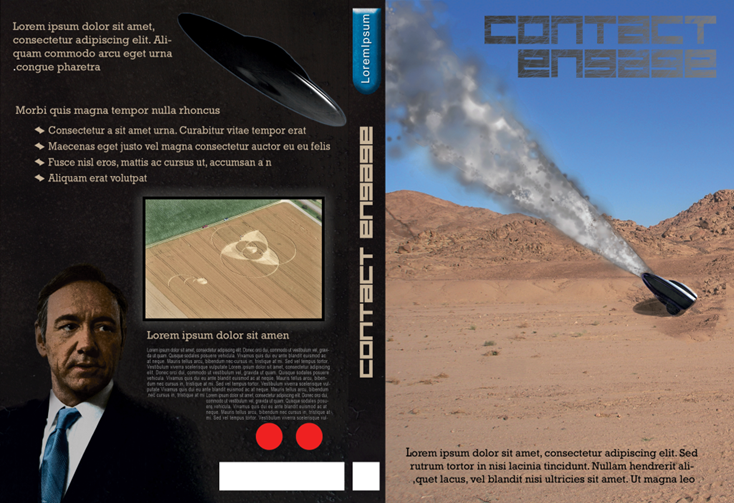
The main title is written in “Feiser” which is free for personal use but available for purchase at Font Shop, the font is similar to “Digital anarchy” that I used in my last design, but the characters are all exactly the same size and lower case.. I left the line spacing as default in this case, but added some other alterations. The body text is Rockwell in various sizes.

After I rasterized the text layer I used the Magic Wand Tool to select each letter, I then applied a horizontal gradient using sandy colour's to match the hue of the background image, I then used the Erase Tool with various brushes to distort the text and give it a scratched surface.
Front Cover

A layer by layer dissection:

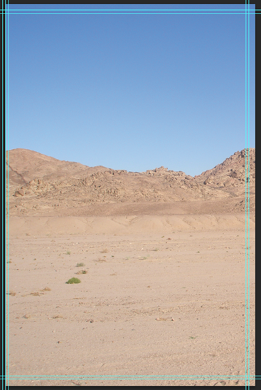
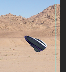
The First layer is a rectangle which has no effect on the overall image, but I used this to create the smart object initially the second layer “Layer 3” is an image found through Google images this needed a small alteration, there was a small piece of foliage which i found to be distracting and would conflict with the intended main visual element of the front cover, so I used the Context Aware Move tool to select and remove the element. The third layer is a ship with altered Shadows/Highlights and a mask applied to create the illusion that it was half buried.


The next 2 layers add effects to the ships position, the first layer adds some broken ground around the shit, to create thus I used the Clone Stamp tool and cloned the rougher ground in the background . the next layer adds a shadow, I resized to create a shadow initially by adding a drop shadow effect to the original shop layer, but I couldn't apply the effect that I wanted to. in the end I duplicated the original layer and used the multiply layer effect, I took the layer opacity down to 37% rotated the shape and adjusted the mask accordingly.


The next two layers add the smoke from the ships flight and lighting effects. The smoke was made with the Cloud Bush made in a previous blog post in different shades of grey, I then use a mask to tidy the edges up, the next layer takes down the brightness of the landscape but uses the same mask (inverted) as the smoke layer, so leaves the smoke bright.


brightness before (left) brightness after (right)


The remaining Layers add the text.
Spine
The spine has a simple design, the text uses the same font and colour as on the front cover but lacks the texture (I didn’t feel it was necessary on the smaller type). the background is a metallic texture that continues from the back cover, the 3D shape at the top was created with the Rectangle tool and the Ellipse tool, the shaped were combined and a Bevel and Emboss effect was applied.
Back

The back cover layout of this is quite simple, the text is the same colour as elsewhere on the case, both the Ship and Kevin Spacey were removed from images found on Google images with the Quick Select and Refine Edge tools, I created a mask around Kevin Spacey and used a soft brush around the shoulders to fade into the background, the layer is set to 80% opacity and is the Vivid light layer type which gives a comic book style effect.
The crop circle image has a black outline and an Outer Glow effect applied, the bullet points on the text were originally created in Adobe Illustrator and copied into Photoshop and recoloured.
Evaluation
Overall I am happy with this design, I think I prefer the look of the front page, I now intend to use a large image with overlaid text on the front, the layout of the back is nice, but I don’t like the empty space under the description, the 3d object at the top of the spine is nice, but needs some work.


No comments:
Post a Comment