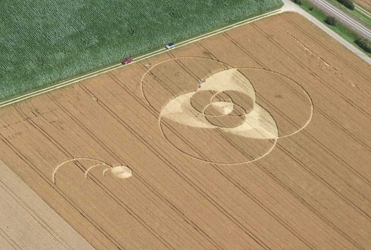
After downloading this image (covered in an earlier blog posts) I decided it could make a good logo for the production, so I proceeded to recreate it in adobe illustrator.
The first thing I had to do was to create an equilateral triangle as a guide for the placement of circles, the easiest way I found to do this was to use the star tool, I simply selected the star tool clicked where I wanted the triangle then when prompted entered 3 points.
An alternative would be to draw three identical lines and join and rotate them, but this would take a lot longer.
I then right clicked tge triangle to make it a guide
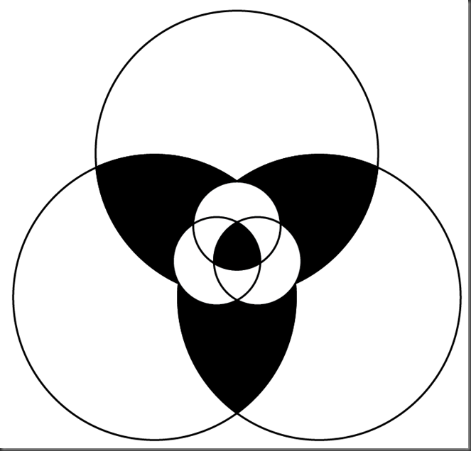
I then made a circle and made three copies of it, and places the centre of ach onto the corners of the triangle guide.
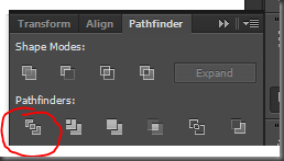
I made a copy of this and used the path finder divide tool and direct selection tool to remove the areas I didn’t need, the path finder divide tool splits all of the paths in a shape, with the direct selection tool I could select individual paths and delete the parts I didn't need.
I then placed this over the original circle and resized while holding control and alt to resize around the centre. I then added some colour, this is the base image of what was used in the rest of my project, though it was often adapted to suit different needs, on my DVD cover it ha a larger stroke for the graffiti, on the DVD label it had different colours and in After Effects it had no stroke at all.


No comments:
Post a Comment